Importing transparent images:
Make sure the image has transparency in Photoshop or Illustrator. Import as a .psd or .ai document. The image will retain it's transparent elements. This allows you to overlap the image itself with other objects, and wrap text to the border of the image, rather than the bounding box.
*When saving an Illustrator file, make sure that the PDF Compatibility option is checked in the Save Dialog box.
Text Wrap
Window>Text Wrap
Buttons:
-No wrap: Lets text flow around an object
-Bounding Box: Flows the text around the object
-Object Shape: Flows the text around the shape of the frame or shape of the placed object
-Jump Object: Flows the text to the next available space under the object
-Jump to Available Column: Flows the text to the next column or text frame
Invert: Causes the text to flow inside object, rather than outside.
Offset Fields: Controls the amount of distance between text and the object
Jeff's Intro to Creative Suite
Wednesday, August 4, 2010
Wednesday, July 28, 2010
Class 7: In Class Materials
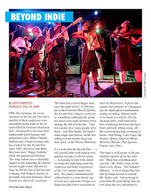
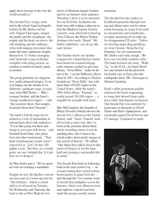


Beyond Indie
By JON PARELES
Published: July 28, 2010
ONE July morning, the seven members of the Arcade Fire and a handful of their employees were assembled on the patio of the elegant Hôtel le Germain-Dominion here, awaiting their tour bus amid haphazardly piled luggage and instrument cases. When Chantal Vaillancourt, a band assistant who has worked for the Arcade Fire since 2006, arrived to join them, they burst into “Happy Birthday” while she grinned and blushed. The song started out as cheerfully ragged as any gathering of a dozen friends might sound. But not for long: by the last line it had become a ringing, full-fledged chorale, in hymnlike four-part harmony. These friends are, above all, musicians.
The band had a much bigger audience the night before: 45,000 people at the Festival d’Été de Québec, the Arcade Fire’s largest crowd yet as a headliner (although the group has faced even more listeners when sharing the bill at festivals). “That was insane, how many people were there,” said Win Butler, the band’s main singer and lyricist, on the bus rolling toward another huge outdoor show, at the Ottawa Bluesfest.
It’s a scale that the Arcade Fire — a self-guided indie-rock band grown popular enough to sell out arenas — is learning to deal with, intent on doing the right thing amid the confusion and tacky temptations of the 21st-century music business. The band is simultaneously a throwback to a more heroic age of rock and a glimmer of hope in a digital era that forces musicians to fend for themselves. It prizes the sounds and methods of a disappearing era: hand-played instruments, analog recording, albums made to be heard as a whole. (On the six-hour drive, with band members wandering betweeen the bus’s front and back sitting rooms, all the conversations kept returning to music: Neil Young, Lady Gaga, the Beatles, Queen, Depeche Mode, Motown, Blondie, Phil Spector, Fugazi, Arvo Pärt.)
The band is well aware of the possibilities opened up by the Internet. “Hope that something pure can last,” Mr. Butler sings on the band’s new album, “The Suburbs” (Merge). “A lot of things like that end up being memos to myself,” Mr. Butler said. “I keep trying to remember the good things that get lost along the way and trying to apply those lessons to the way the world actually is.”
The Arcade Fire’s songs, credited to the whole band but largely written by Mr. Butler and his wife, Régine Chassagne, mingle the punky and the symphonic, the cryptic and the heart-on-sleeve, the self-doubting and the anthemic, often with surging crescendos that make the tunes optimistic despite themselves. It’s both a stomping rock band and a mini-orchestra, complete with string section, accordion or medieval hurdy-gurdy as needed.
The group performs in a hyperactive, partly planned rumpus. Even as it brings out the details of its elaborate, multipart songs, it maintains what Will Butler — Win’s younger brother, and the band’s vintage-synthesizer expert — calls “that amateur sheen, that nonprofessional sheen that I treasure.”
The band’s full-tilt stage shows started as a way of demanding attention from aloof club audiences. “It was like going out there and trying to tear your club down,” said Richard Reed Parry, who plays bass and other instruments. “That kind of performance mode wasn’t conceived as, ‘Let’s do this 200 nights a year.’ But then, at a certain point, we can’t rethink this. It’s just how we’re doing it.”
As Win Butler put it, “We’re sprinters who are running a marathon.”
Despite its size, the Quebec concert was just part of a warm-up tour for “The Suburbs,” which is scheduled to be released on Tuesday. On Wednesday and Thursday the band is due in New York for two shows at Madison Square Garden and for an Internet-wide audience; Thursday’s show is to be streamed live on YouTube. In Quebec the band was still seeking a director to film the Madison Square Garden concerts; soon afterward it lined up Terry Gilliam, the Monty Python alumnus who made “Brazil.” Mr. Butler called him “one of my ultimate heroes.”
The Garden shows are another conquest for a band that has barely been heard on commercial pop radio stations yet had its previous album, “Neon Bible,” make its debut at No. 2 on the Billboard album chart in 2007. According to Nielsen Soundscan “Neon Bible” has sold more than 439,000 copies in the United States, while the band’s 2004 debut album, “Funeral,” recently passed 504,000 copies — a megahit for an indie-rock band.
Mac McCaughan, the founder of Merge Records (which releases the Arcade Fire’s albums in the United States), said, “Since ‘Funeral’ took off in such a crazy way, they’ve been in the position almost their whole recording career to not do anything they don’t want to do, which makes them pretty unique at this period of history.” He added, “One thing they talked about is this sense of being in it for the long haul and creating a sustainable life in music.”
The Arcade Fire built its following both in the time-tested way — incessant touring that carried it from house parties to giant festivals — and through the 21st-century word of mouth that multiplies across the Internet, where rave album reviews and euphoric concert reactions made the group a nearly instant sensation.
The Arcade Fire also makes its livelihood primarily through touring and album sales, not by extensively licensing its songs to be used in commercials and soundtracks, as many musicians do to make up for disappearing CD sales. “Unless we develop major drug problems, we won’t license ‘Keep the Car Running’ for car commercials,” Mr. Butler said with a laugh. “We have our own little aesthetic rules.” The band licensed one song, “Wake Up,” to the N.F.L. for Super Bowl use and donated all the proceeds for health care in Haiti after the earthquake there; Ms. Chassagne is Haitian-Canadian.
Rock’s older generation quickly embraced the band, responding to songs that showed large ambitions rather than hipster exclusivity. The Arcade Fire was endorsed by musicians as disparate as David Byrne and Bruce Springsteen, and eventually joined David Bowie and U2 onstage. Compared to many indie-rock sensations, “we were a maturer band,” Will Butler said. “It was art-rock. It wasn’t attitude rock.”
(Excerpt from New York Times article.)
Class #7: InDesign
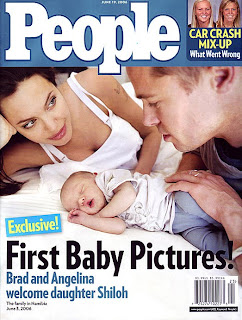
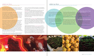

Indesign is Adobe's page layout program. It has rudimentary image making capabilities, but it's main strength is assembling images created in other programs. Conveniently, InDesign uses many of the same tools as Photoshop and Illustrator, so much of what we've already learned can be applied here as well.
*Indesign is the glitchiest of the 3 programs, so be sure to save often!
Desktop Functions
-Before beginining projects in Indesign, it is important to set up your files in an organized manner. Start by creating a new folder on the desktop. Keep all of your source files and working files in this folder, and don't change file names once you begin assembling, or InDesign won't be able to keep track of your images.
Create folders
-On the desktop, go to File>New Folder. When the name is highlighted you can rename the folder, or...
-Ctrl+click on the desktop and select New Folder
How to Find Documents
On the desktop, hit Command>N or click on the MAC OS logo at the bottom of the screen to pull up the Finder Window. Then, navigate the folders to find your desired document, or enter a keyword into the search bar on the top left and press enter.
New Document
-columns
-gutter
-margins
Units of measurement are automatically set to points. Simply type "in" after the number to convert to inches
Black line- Border
Purple Line-Margins
Similar to Illustrator, there is a artboard area that allows you to work outside the document space. This only appears in Normal Viewing Mode.
Viewing Modes
To get a better sense of your final design, you can hide guides using Viewing Modes
Normal Mode- Shows Guides, Rulers, and the Artboard.
Preview Mode- Only shows the printable elements.
Rulers
Guides-set guides by dragging from the rulers on the top and lefthand side of the artboard. Hide them, or lock them in place using Window>Guides. You can delete them by clicking on them and pressing the delete key.
ToolBox
Important Panels
-Links
_Color
-Pages
-Swatches
Text boxes
• Unlike Illustrator and Photoshop, InDesign requires you to drag a type container to create text. Like Illustrator, text will automatically wrap to fit the container.
• If your text goes beyond the container, a red icon will appear at the bottom of the container. To fix this, either change the size and shape of the container, or click on the red icon to load the cursor with the remaining type, then click elsewhere to create a new overflow text box. This can be done as many times as you want, as well as across as many pages as you want. Very handy!
Import Pictures
Use File>Place to import pictures into your document. After you select the file you want, the cursor will have an icon next to it indicating that it's "loaded" with the image. Just click to paste.
*Make sure you don't have a text container or object already selected, or the new image will fill the selection!
Editing Objects and Pictures
Object>Fitting: Fits Container to Image
Object>Transfrom: Allows you to mainpulate objects and images similar to Illustrator.
Managing Links
• Links Palette
Saving Vs. Exporting
•Use Save to maintain your working file. The file format is .indd. To prevent your links from being broken, make sure you keep the original art and working InDesign Document in the same place.
•Use Export when you are finished with your project and are ready for print. Export saves your documents as more usable files, such as PDFs, or JPEGs.
Class Assignment:
Take pictures and text and create a 2 page magazine layout.
Wednesday, July 14, 2010
Sample Text
History of Type
Typography is the art and technique of arranging type, type design, and modifying type glyphs. Type glyphs are created and modified using a variety of illustration techniques. The arrangement of type involves the selection of typefaces, point size, line length, leading (line spacing), adjusting the spaces between groups of letters (tracking) and adjusting the space between pairs of letters (kerning).
Typography is performed by typesetters, compositors, typographers, graphic designers, art directors, comic book artists, graffiti artists, and clerical workers. Until the Digital Age, typography was a specialized occupation. Digitization opened up typography to new generations of visual designers and lay users.
Typography traces its origins to the first punches and dies used to make seals and currency in ancient times. The typographical principle, that is the creation of a complete text by reusing identical characters, was first realized in the Phaistos Disc, an enigmatic Minoan print item from Crete, Greece, which dates between 1850 and 1600 BC. It has been put forward that Roman lead pipe inscriptions were created by movable type printing, but this view has been recently dismissed by the German typographer Herbert Brekle.
The essential criterion of type identity was met by medieval print artifacts such as the Latin Pruefening Abbey inscription of 1119 which was created by the same technique as the Phaistos disc. In the northern Italian town of Cividale, there is a Venetian silver retable from ca. 1200 which had been printed by the means of individual letter punches. The same printing technique can apparently be found in 10th to 12th century Byzantine staurotheca and lipsanotheca. Individual letter tiles where the words are formed by assembling single letter tiles in the desired order were reasonably widespread in medieval Northern Europe.
Modern movable type, along with the mechanical printing press, was invented in mid-15th century Europe by the German goldsmith Johannes Gutenberg. His type pieces from a lead-based alloy suited printing purposes so well that the alloy is still used today.[12] Gutenberg developed specialised techniques for casting and combining cheap copies of letterpunches in the vast quantities required to print multiple copies of texts; this technical breakthrough became instrumental for the success of the almost instantly starting Printing Revolution.
Typography with movable type was separately invented in 11th-century China. Metal type was first invented in Korea during the Goryeo Dynasty around 1230. Both hand printing systems, however, were only sporadically used and discontinued after the introduction of Western lead type and the printing press.
Class 6: Working with Type
Today we're going to cover some of the basics of text editing in Illustrator. Many of these tools and functions are similar across all Creative Suite programs, so apply these lessons as needed to Photoshop and InDesign as well.
The Tools:
There are three horizontal type tools: The Type tool, the Area Type tool, and the Type on a path tool. Each of these has a vertical counterpoint.
• Type Tool- Creates a block of type that isn't associated with a path. You can also draw a rectangle with it and enter type inside the rectangle; you can use it to enter type along the edge of an open path; or you can use it to enter type inside a closed path. It is the most versatile of all type tools.
• Area Type Tool- Creates type inside an open or closed path. Lines of type that are create with this tool automatically wrap inside the path.
• Type on a Path Tool- Creates a line of type along the outer edge of an open or closed path.
Character Window
To open the Character Window, click on the "A" symbol on the right hand panel, or go to Window>Type>Character in menu bar at the top of the screen. This window allows you to change fonts, sizes, and letter spacing. Basically, all of your word processing functions.
Point Type/Text box
If you simply click on a blank section of the art board, you can immediately start typing away. This is called Point Type. It is neither inside an object nor along a path. This kind of type is appropriate for small amounts of text that stand independently, such as headlines and titles.
With the type tool selected, you can also create a text container, by dragging the mouse to create a rectangle. When you release the mouse, a flashing marker will appear, and you can being typing. Type inside this container will wrap automatically to fit the area, making this tool perfect for paragraphs and other large bodies of text.
*You can edit the shape of the text container after the fact, and the type will readjust itself accordingly.
Import text
Bringing in text from an outside source is easy. The simplest method is:
-Copy type from a word processor, web-page, or other source (Command+C)
-Then, in Illustrator, click on the artboard with the type tool (or drag a text container)
-Paste (Command+V).
This is often a good idea when dealing with lots of text, because you can take advantage of the more comprehensive spellcheck and grammar check of word processors.
Area Type
To fill a closed object with type, use the Area Type tool. Click on the edge of a shape, and a flashing marker will appear. The fill and stroke of the path will disappear, and you can begin writing or pasting text. Like a text container, the type will hug the contours of the shape automatically.
Type on a Path/Type on an Ellipse, etc.
To create text along the outside of a shape, use the Type on a Path Tool. Much like the area type tool, just click on the outside edge to begin typing. Don't hit return or enter though, this tools works for single lines of type.
The selection arrows allow you to edit the positioning of this type after the fact. When you click on the type, 3 brackets will appear.
• The left bracket adjusts the starting point
• The right bracket adjusts how much type shows
• The Center bracket moves the type along the path.
Type on a Path options:
To edit the appearance of type on a path, go to the top of your screen at click Type>Type on a Path>Type on a Path options.
This allows you to move the type inside the path, outside the path, and flip it's orientation.
Type Effects
At the top of the screen under Effects>Warp, there are various preset type effects, similar to those in Photoshop. Try them out for neat effects!
Appearance Panel: To re-edit effects after they've been committed, use the Appearance Panel. If you can't find it, click on Window>Appearance, up at the top of the screen.
Create Outlines
Classwork:
-Follow along as we explore various ways to edit type.
Homework: Think about a project you'd like to do for the final assignment, using all 3 programs we've learned in here.
Examples:
-Brochures
-Portfolios
-CD covers and liner notes
-Page Layout
Wednesday, July 7, 2010
Class #5: Pen and Shapes



Shape Modes
• Add: Joins the outer edge of selected objects into one compound shape. Think of it like adding to a silhouette.
• Subtract: Subtracts the shape of the object in front from the object in back while preserving the paint attributes of the background object. Think of it like a cookie cutter.
• Intersect: Protects overlapping areas and removes areas that don't.
• Exclude: Removes overlapping areas and preserves everything else.
*Keep in mind which shape is on top when joining or subtracting two overlapping shapes. The top shape is the one removed when subtracting, and it's the top one that retains it's color and properties when another is added to it.
Pen Tool
The pen tool is an incredibly versatile tool, but unfortunately, it is also the most difficult. Mastering it requires patience and practice. I'll show you a few basics, but it will be most beneficial to practice on your own to really get a feel for the tool.
Straight lines:
• To create straight lines, simply click to set an anchor point, then click another area to lay a second anchor point with a connecting path in between. This creates corners with no curve to the line. To close the shape, click back on your starting anchor point.
Curved lines:
• To curve your lines, drag rather than click when setting anchor points. Directional lines (also called bezier curves, or handle bars) will extend beyond the point. These handles move in tandem, and the curve of the line will be determined by the length and direction you move the mouse. The longer the direction line, the steeper or longer the curve.
*Remember, you can always reshape the curves later by using the direct selection tool. It's always best to start with broad shapes, then go back and make refinements.
Class Assignments:
1. Using different colored circles, we will explore the add, subtract, intersect, and exclude functions.
2. We'll then use various tools to recreate snowflake designs.
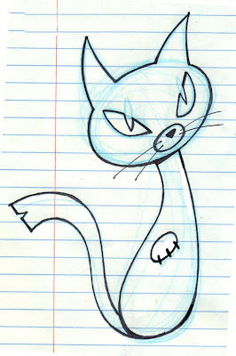
3. Using the pen tool, we'll recreate a cartoon cat.
4. Using everything we've learned up 'til now, we're gonna tackle the snowman from last week.
Illustrator Essentials Recap
Illustrator creates art out of shapes. These shapes are comprised of paths (the line of edge of a shape) and anchor points (the little boxes along the edge of the shape. By adding to, subtracting from, and stacking various shapes, you can create all kinds of images. Here's a recap of some essentials.
Tools:
• Selection Arrow (V): Selects shapes in their entirety. Allows you to scale, squash, stretch, move, and change the color/stroke of an object. You can also drag a box around multiple shapes to select multiple shapes at once!
• Direct Selection Arrow (A): Selects a path segment or anchor point, depending on where you click. You can pull the anchor points themselves to distort the shape, or use the handles to adjust the curves. This allows for much greater and precise control over an object than the simple Selection Arrow.
•Ellipse (L), Rectangle (M), and other shapes: Basic shape making tools. Click and drag to make a shape, or simply click and type the shape dimensions in the dialog box. Shapes are always editable.
• Arrange the stacking order of objects by going to the top of your screen and selecting Object > Arrange, then picking which direction you'd like to send the shape(s) in question. The shortcut to send an object back or forward a layer is Command + [ or Command + ].
Handy Mouse and Keyboard Functions:
• Hold the shift key while dragging to create shapes in perfect dimensions (circles, squares, etc.).
• Hold the shift key while moving a shape to move it in perfect alignment vertically or horizontally from its original position.
• Hold the option key while moving a shape to create a duplicate. If you hold shift and option together while moving a shape, you can create a duplicate shape and move it in perfect alignment to the original. Very handy when trying to create orderly rows of identical objects (like stars on a flag)!
Other Useful Bits:
• Templates: In the layers panel, click on the drop down menu to the right of the word "Layers". Select template, then make a new layer above it to work on. This allows you to trace imported images. Remember, the idea is to use imported images as template to base your new art on, not as a part of the art itself.
• To get a better view of what you are tracing, hit Command + Y to go into Outline Mode. Command + Y again takes you back out. If you're stuck, and you don't see any colors or fills in your shapes, you may be in Outline Mode inadvertently. Watch out!
Colors:
• Color is edited on bottom of the toolbox. To edit the color of an object, click on the Fill color box (left box). To edit the outline color of an object, click on the Stroke color box (right box). You can also set either to none, using the None button to the lower right of the Stroke box.
• Pick colors by double clicking on the Fill or Stroke box, then use the picker to select a new color. You can also select colors from the swatch panel on the right side of the screen.
*If you can't find a specific panel in any Adobe program, click on "Window" at the top of the screen, then click on the window that you are looking for.
Subscribe to:
Comments (Atom)